eComXLoading
0%
Normcore · v2.5

Four new banner sections and highlighted headings for Dynamic Grid

Normcore 2.5.0 is a storytelling release. Four new banner sections, Scrolling Cards, Reel Hero, Peek Gallery and Stacked Showcase, let the first screen of your store do more than show a single image, and a Grid Heading block makes the words that matter stand out in Dynamic Grid layouts. When your catalog runs to thousands of products, these sections help buyers see your range, trust your brand and find the right collection faster. Cart prices now reflect B2B volume pricing correctly, and theme editor labels show in the right language for German, Spanish and French.

Highlights · 05

What changes for your store

[01]

Put social proof and press in constant motion with Scrolling Cards

A section of customer photos, creator videos and press mentions that scroll on their own beside your headline. Buyers see a steady stream of real people and trusted names, which builds confidence in a big store they may not know yet, and each card can link straight to the product it shows.
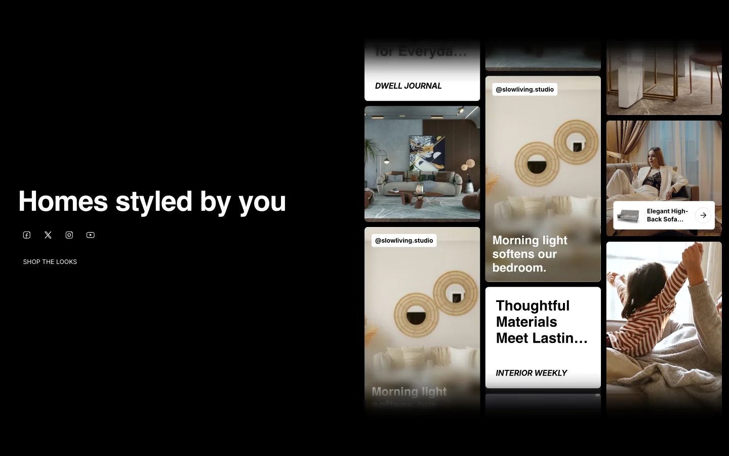
Scrolling Cards with creator and press cards beside a heading

[02]

A video homepage that lets buyers choose the story with Reel Hero

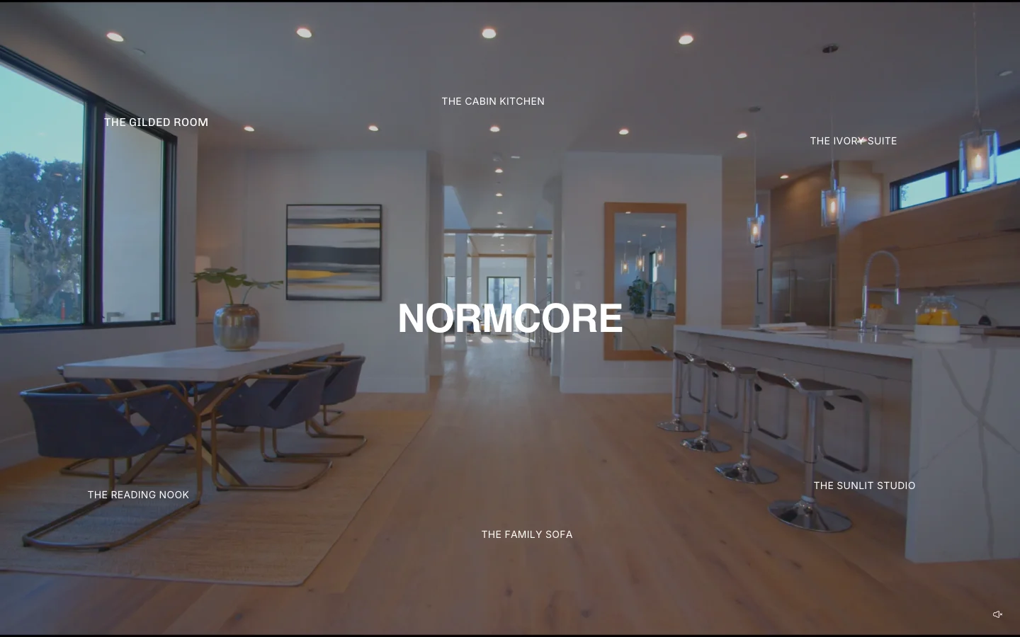
A full-screen video banner with several story titles placed around your headline, each opening its own video. Instead of promoting one thing, your homepage can spotlight several collections or campaigns at once, so buyers pick the part of your range they care about.

Reel Hero video banner with story titles around a central heading

[03]

Invite buyers to see what comes next with Peek Gallery

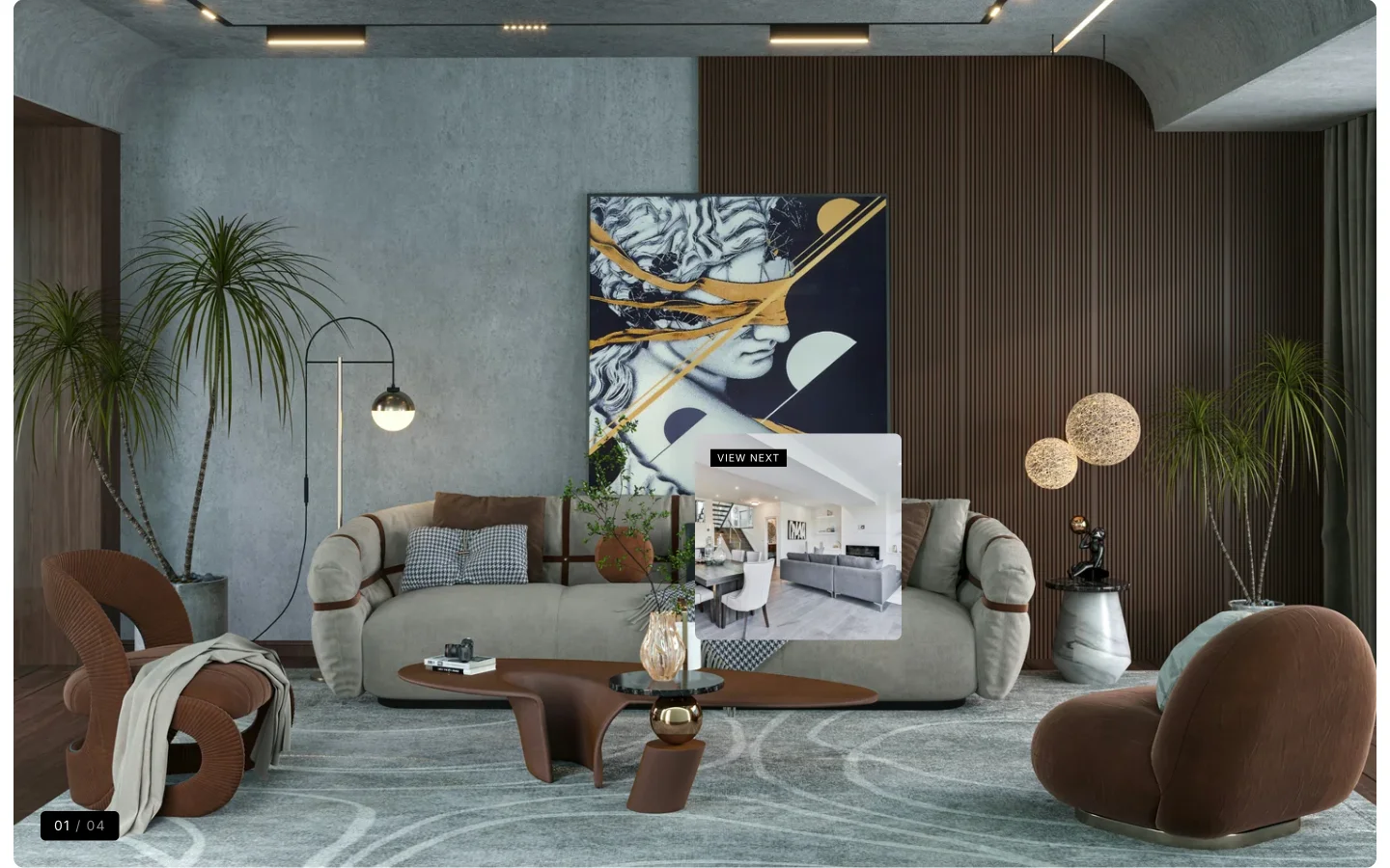
A full-width image gallery that shows a small preview of the next image as buyers move their mouse. It invites them to keep going, so a lookbook or new collection gets seen from start to finish instead of skipped.

Peek Gallery with a preview of the next image following the cursor

[04]

Browse categories in a 3D card deck with Stacked Showcase

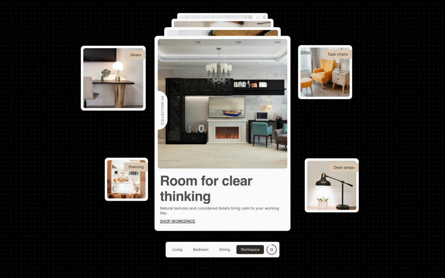
Your main categories shown as a stack of cards buyers can flip through, with smaller product cards floating around it. A long list of categories fits in one compact section, and it can rotate on its own to keep showing more of your range.

Stacked Showcase 3D deck of category tabs with floating cards

[05]

Make key words stand out with Grid Heading

A new heading style for Dynamic Grid that makes your key words stand out with a circle, underline or marker effect. It points buyers to what matters most in a campaign, like a sale or a new arrival, at a glance.

v2.5.0 · 9 changes

Full changelog

New [07]

  • Scrolling CardsNew section pairing a content panel (heading, social media links and buttons) with columns of cards that scroll endlessly in opposite directions, turning into a single sideways row on mobile. Media cards take a video or image, a quote, an account badge and an optional product link; press mention cards show a headline with the publication's logo. Columns pause on hover or tap, and the column edges can softly fade out.
  • Reel HeroNew full-screen video banner with story titles placed around a central heading. Hovering a title peeks at its video from the nearest edge, and clicking opens it full screen. Supports per-story positions and title styles, a blur lens that follows the cursor over the heading, and a sound toggle.
  • Peek GalleryNew full-bleed image gallery where a preview of the next image follows the cursor and grows to fill the section on click.
  • Stacked ShowcaseNew section with a 3D deck of tabs and floating cards that flip to reveal a title and tag, optionally pulled from a product, with autoplay between tabs.
  • Dynamic GridNew Grid Heading block with viewport-scaled sizing, vertical text and a choice of HTML tag. Words wrapped in [brackets] are highlighted either by the new Theme settings > Typography options (highlighted font, color, or a line or wave underline with its own thickness and color) or by a per-block effect: circle, marker, underline, zigzag, sketch box, glowing stars, sparkle dust, pearl dots or blossom petals. Grid items added in the theme editor now start with an image block.
  • Fullwidth LogoSeparate logo max width setting for mobile.
  • XFLOWBack-in-stock buttons from the XFLOW app on product cards and the product page now match the theme's primary button.

Improved [01]

  • Hero GalleryThe main media keeps its corner radius once it settles into the grid, including at full width.

Fixed [01]

  • CartWith B2B volume pricing or discounts, cart lines now show the actual unit price with the original price struck through, and changing a quantity in the cart no longer previews an incorrect tier price.

About 2 minutes

How to update

Full guide in the Help Center
  1. [01]

    In your Shopify admin, go to Online Store > Themes.

  2. [02]

    On Normcore, click Update available, then Add to theme library. Shopify copies your settings and content across.

  3. [03]

    Preview the new copy, check your key pages, then click Publish.

Normcore · $320 · Free to try

Not on Normcore yet?

Normcore is a high-performance Shopify theme built for merchants with extensive product catalogs. Try it free. Pay once when you publish.